HLPR.
Being approached on the street by a person asking for help can be a situation loaded with social anxiety. It can be difficult to know how to help, or if the help you provide actually benefits the asker. And, what if you don’t carry cash?
Dragonfly’s founders have worked with Memphis’ homeless population for years. They came to us with a vision for an app that gives people an easy, cash-free way to provide a night at the shelter, a meal or transportation for an asset-deprived person.
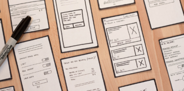
Fully building out the app with multiple integrations would be a big undertaking. To get a better idea of the scope, Dragonfly asked us to create a map of possible paths a helper may take when using the app to navigate an interaction with an asker. Additionally, we were asked to create an interactive prototype that Dragonfly could use to demonstrate the app’s capabilities to potential investors and likeminded civic organizations.
Thinking It Through
We started by role-playing interactions and mapping flows for the app’s distinct subpaths: offering shelter, offering a ride, providing a meal, or some combination of the three. And, while some integrations (like searching a database of local shelters) would be relatively straightforward, others like ordering food for a stranger) could get extremely complex.
The Happy Path
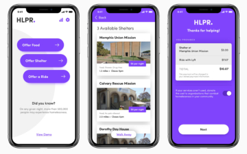
For the proof of concept, we defined a happy path experience that showed the process for booking a night at the shelter then providing a ride, demonstrating the app’s capabilities without distracting the audience with too many variables. After making a paper prototype to determine the number of screens and requirements, we built an interactive prototype using Invision Studio.
Though our work was focused on user experience, the prototype needed polish to impress potential partners.
Visual Brand
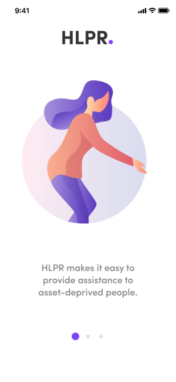
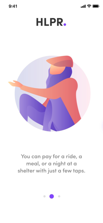
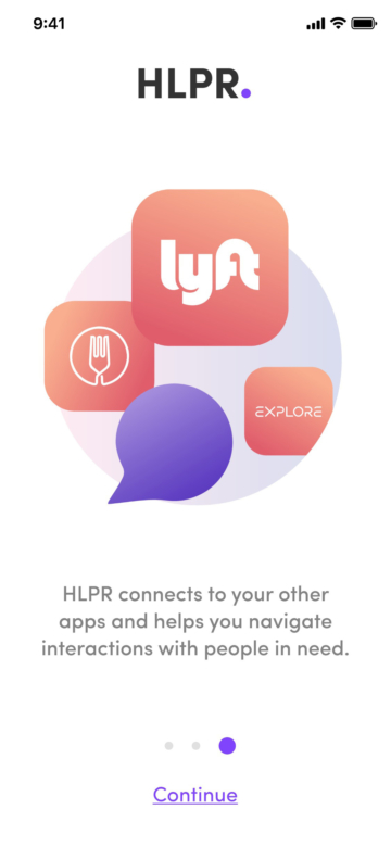
We designed illustrations that show how the app promotes connection between people. The people we drew were deliberately faceless to help users see themselves in the interactions. For the brand’s dominant color, we chose a friendly, trendy purple.
Voice and Tone
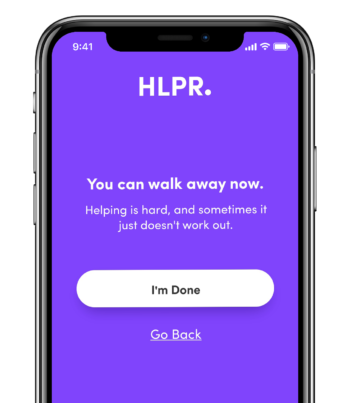
For in-app copy, we developed a brand voice that smooths potential awkwardness by being empowering, reassuring and kind. And, we were careful to choose humanizing, non-judgemental language that reduces stigma and puts everyone at ease.