I’m a designer and nerd (if that wasn’t redundant). I was into F1 before Netflix made it cool, and building model cars and playing racing sims have been a couple of my favorite hobbies for more than two decades. Each hobby has made the other more interesting. Models have taught me a lot about how race cars work in the mechanical sense, and sim racing has helped me appreciate what goes into competition at the driver’s level - the racing line, changing conditions, when to defend, when to send it, and the nuances of different tracks that appear on Sunday morning races.
I love the fact that graphic design is a hybrid discipline, a healthy mix of art and science, left-brained creativity and right-brained data. I think auto racing is similar – a combination of human athleticism and technical engineering - which probably explains my interest in the latter. And when they come together, I can’t help but take notice.
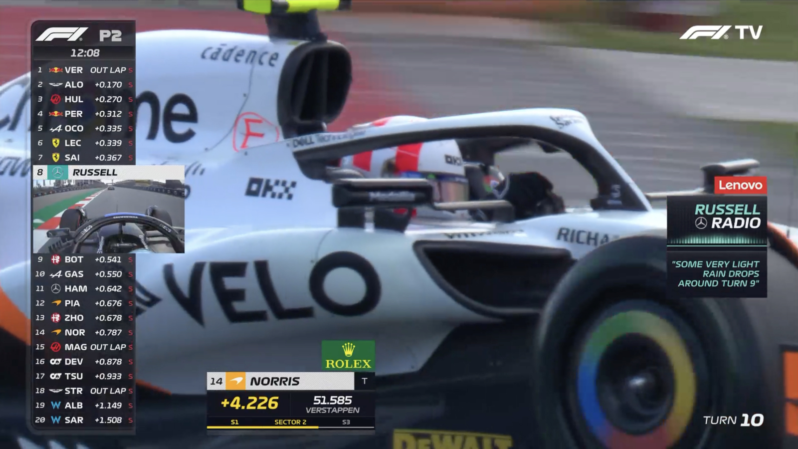
There are lots of opportunities to geek out on the intersections between graphic design and motorsport: racing liveries, the barrage of brand identities, and information graphics. But I wouldn’t be a true nerd if I didn’t zoom in on one of the lesser-studied aspects - the branding design of race track logos - and how some do a better job than others at communicating what they’re like.
What is a race track logo?
Race track logos are a little bit of a special use case. Unless they’re visiting a track in person, a spectator is more likely to see the logo for an event (like the Indy 500) than they are for the track (the Indianapolis Motor Speedway) when they watch a race. Drivers, in the real world and in virtual space, probably encounter tracks’ branding more often. In racing sims, you’ll see them when browsing the track catalog or setting up a racing session.
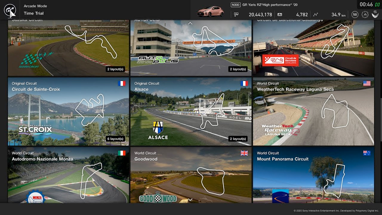
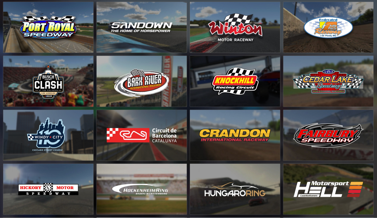
Every track has a backstory, physical characteristics, and a personality that can be captured in a visual identity (to varying degrees of success). In addition to real-world circuits, many games also feature fictional tracks that only exist virtually - complete with their own brand designs, which I judge no differently. As I’ve experienced more tracks, either in-sim or in-person, and noticed trends among their logos, I’ve formed some rules for what separates the winners from those that could use a tune-up. For the non-racing-fans out there, I’ll do my best to help convey what actually makes these places special and how it translates to a branding challenge for logo designers. Which brings us to…
John’s Four Rules
of Race Track Logo Design
Rule #1 – Nail the fundamentals.

Logos are a foundational element of any brand’s visual identity. And racing-related or not, the fundamentals of good logo design remain the same.
Simplicity
The simpler the mark, the more legible and memorable it can be. Logos need to work at a variety of sizes in a variety of situations. Do they need to be black and white? That’s debatable in 2023, but too much detail can just create noise.
Uniqueness
A logo needs to be distinct to be owned. Simplicity is often at odds with uniqueness, but that’s part of what makes balancing the two such a fun design challenge. Knowing your audience and what makes a brand special are crucial to breaking ahead of the pack.
Rule #2 – Look fast.
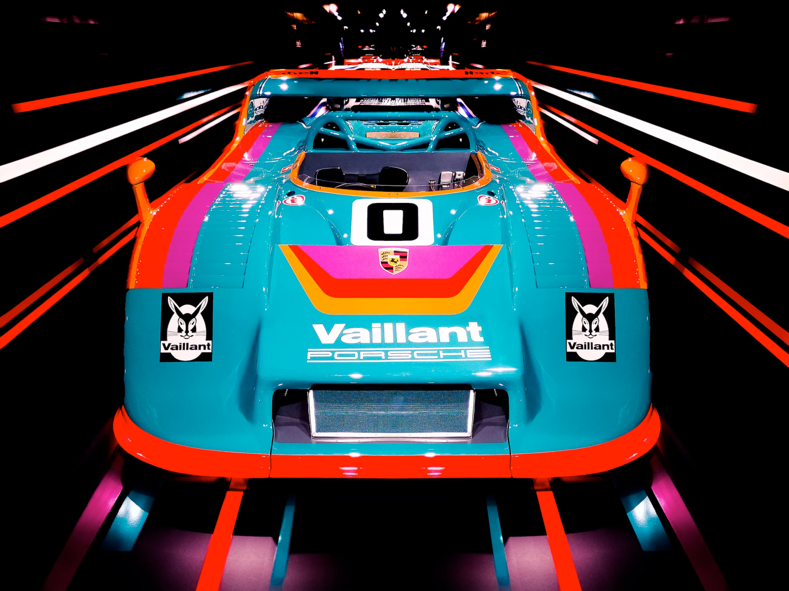
The logo for a race track shouldn’t look like the logo for a law firm or a petting zoo. Racing comes in many flavors - be it 2- and 4-wheel, sprint and endurance, drag and circuit - but it’s always a competition of speed, performance, engineering, and athleticism.
As the setting for that competition, track logos should reflect the spirit of racing. But, they can do so without relying too much on tropes of checkered flags, car silhouettes, pistons and flames. The technology and cars on tracks change a lot more often than the tracks themselves, so I would avoid their use. Racing can be evoked through expressive use of color, typography and shapes, not just by taking some red text, slanting to the right, and adding a checkered flag.


Rule #3 – Evoke a sense of place.

From a driver’s perspective, the layout of a track is what gives it most of its character. But that layout is usually the direct result of the terrain where it was built. Some are parking-lot flat, built on old airfields. Others snake their way through hilly forests. Some are dirt, some are asphalt. All these differences suit different types of racing and different drivers’ sensibilities. When designing a track’s logo, the designer should consider qualities like terrain, climate, size, signature features and overall mood. It’s helpful to imagine the atmosphere around the track during an event.
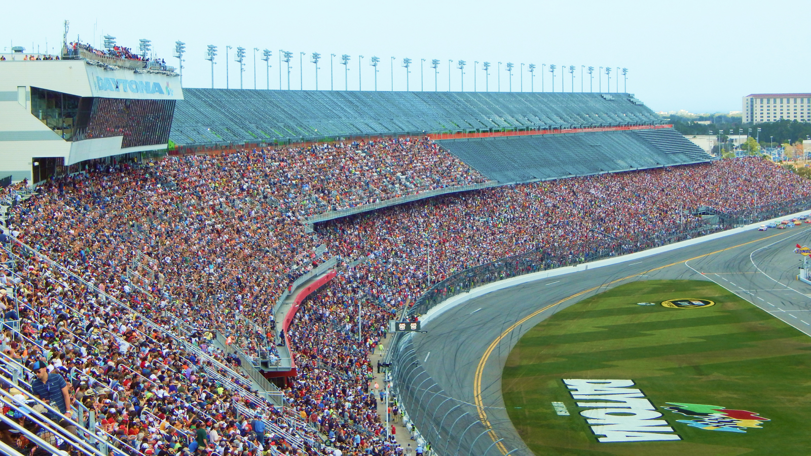
A track’s logo should communicate more about what it’s like to be there than the shape of the tarmac. Don’t take the easy way out by using a map of the track. Many tracks have different configurations, and can be reshaped dramatically over the years as racing and safety regulations change. Let’s look at some examples:


Rule #4 – Embrace change.
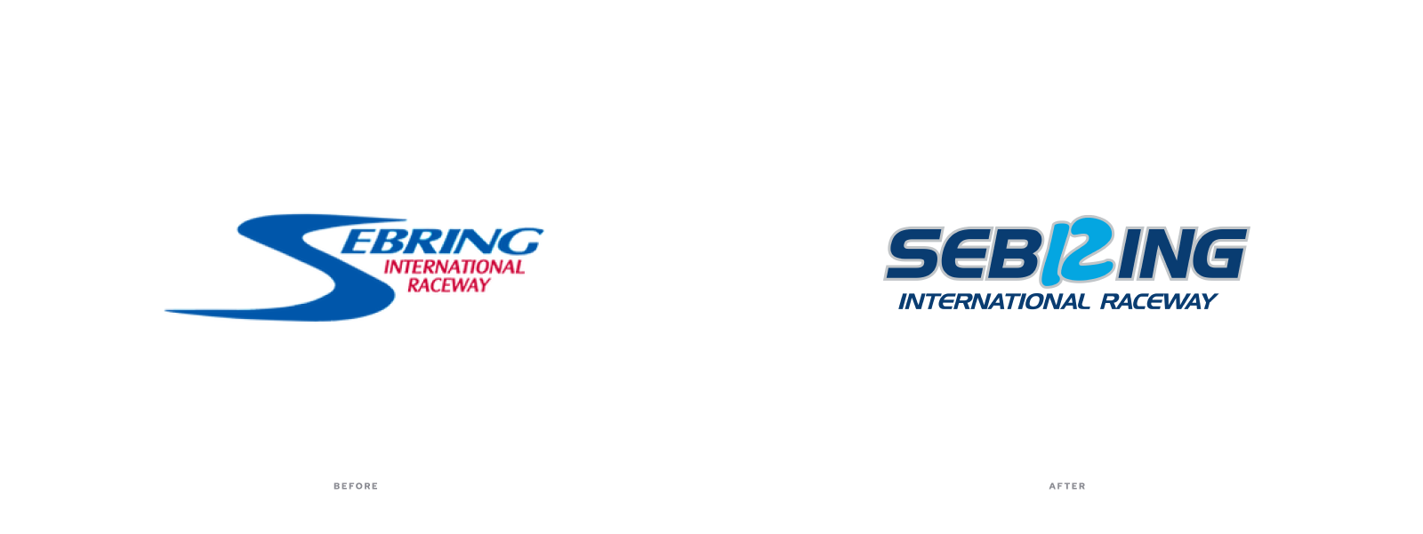
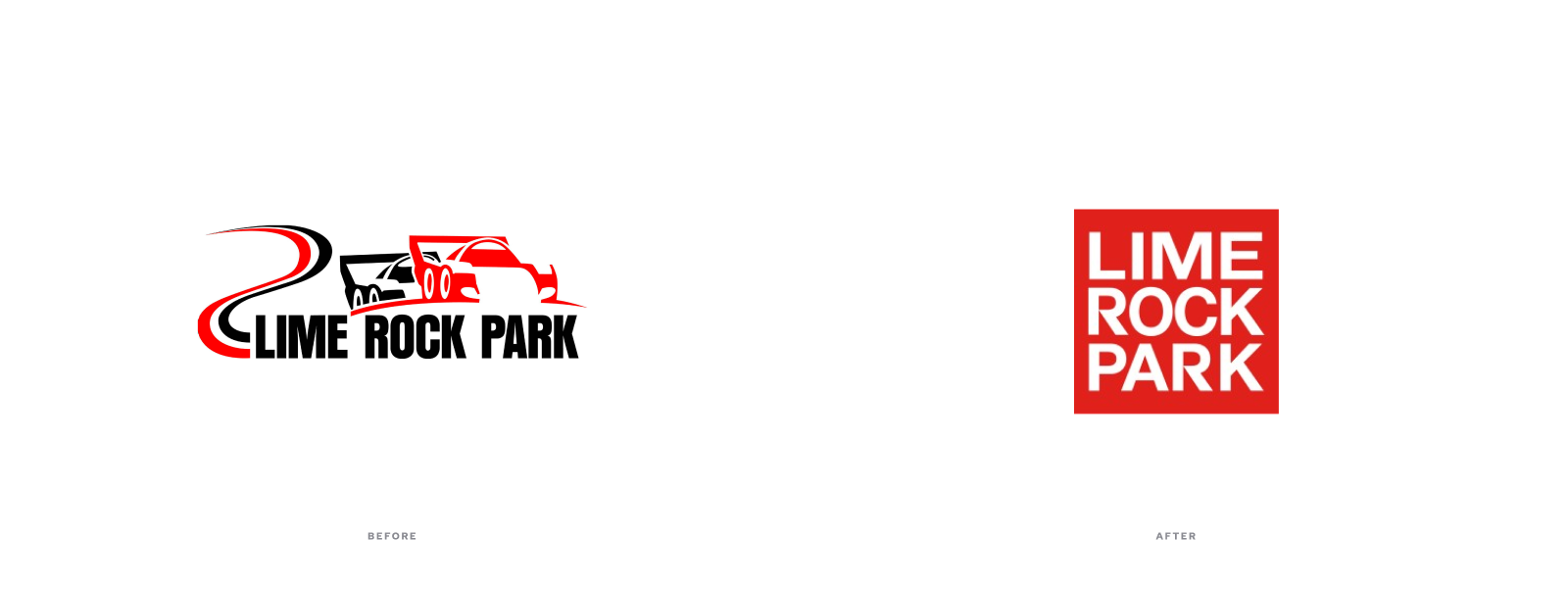
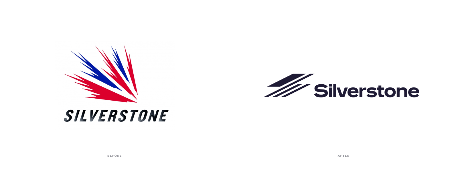
In the process of putting together this post, I saw that a few tracks had under gone a rebrand and gotten new logos. Most have made the leap from just having an amateurish, outdated mark to embracing a modern, sophisticated brand system. But, I couldn’t help feel some are too slick for their own good. I don’t think every race track logo should be as stripped-down and iconic as the glyph-like logos of Target or Nike. Sometimes, a lack of sophistication is what gives a logo its charm and memorability. Taking into account a legacy logo’s idiosyncrasies and recognition among fans should be a part of any rebranding brief. Let’s look at some final examples:

I could keep going, but there’s another race starting. See you at turn one!

