
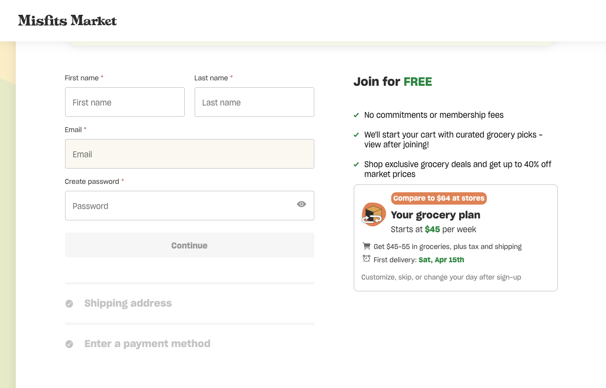
When I was stuck at home during COVID lockdown, I signed up for a subscription grocery service for the first time. Every two weeks, Misfits Market sent me a box full of fresh produce, as well as any extra groceries I wanted. I really liked it. The company was committed to reducing food waste by selling perfectly good produce that would otherwise be thrown out. The products were high quality, and they sent me veggies I’d never tried, which made me more creative in the kitchen. And, it saved me trips to the grocery store at the height of a global pandemic.
I was hesitant to sign up at first. What if it was too expensive? What if I didn’t like it? What if it was just way too much food? I lived alone and wanted to avoid piles of produce rotting in my fridge because I couldn’t eat them fast enough.
Their site was reassuring - before I signed up, they let me know I could skip weeks, pause my service, or cancel whenever I wanted. Having that information made me feel like the company cared about my experience, and made me a lot more comfortable handing over my credit card info.
But what about when a user doesn’t have that information up front, or the information isn’t clear?
That’s the core question I’m trying to answer in this series: If people have adequate cancellation information during sign up, are they more likely to set up recurring purchases?
To start finding the answer, I dove into the world of subscriptions for physical products, conducting a UX review to see how companies present information about cancellation before a user signs up.
How I Went About It
I picked 10 companies that offer goods on a recurring basis - everything from meal kits to toilet paper to a subscription for pants (really).
Five of the companies allow users to make both one-time and recurring purchases. The other five are inherent subscriptions - you have to subscribe in order to get the goods.
To evaluate them, I set some limits:
- I picked a product I’d actually need, want or use to keep it realistic.
- I focused on how each company presented information about cancelling and/or modifying subscriptions in the sign up flow, starting from the homepage or product detail page and stopping at the point where payment was required to continue.
- I also looked to see if cancellation and modification info was presented outside of the sign up flow, like in FAQs, on How It Works pages, in body copy, etc.
- I reviewed all of the sites on my laptop, working under the assumption that the experiences would be similar on my phone.
I wanted to see if there were any patterns in how these companies talk about cancelling or modifying subscriptions. And as a user, I wanted to see how the experiences felt and why. Did I feel informed? Confident? More anxious than usual? Ready to buy? Only one way to find out.
There Are Patterns
I noticed some patterns in how subscription goods companies talk about cancellation and modification pre-purchase.
- All 10 companies mentioned cancellation in the sign-up flow to varying degrees.
And, all of them mentioned it more than once in the sign-up flow. Cancellation was most commonly mentioned when you select your product (usually the first step) and on the screen when you provide your payment info. This makes sense - if a company wants a user to commit, they should do whatever they can to reduce anxiety on those crucial first and last steps.
- Cancellation info was generally presented in obvious places.
On the product selection step, the information was typically located either near where you select if you want to subscribe or make a one-time purchase, or near the continue button. On payment pages, the info was often presented as plain text, in fine print, or both.
The experiences that made me feel the most confident were those that positioned the information in a way that was hard to miss. Like this: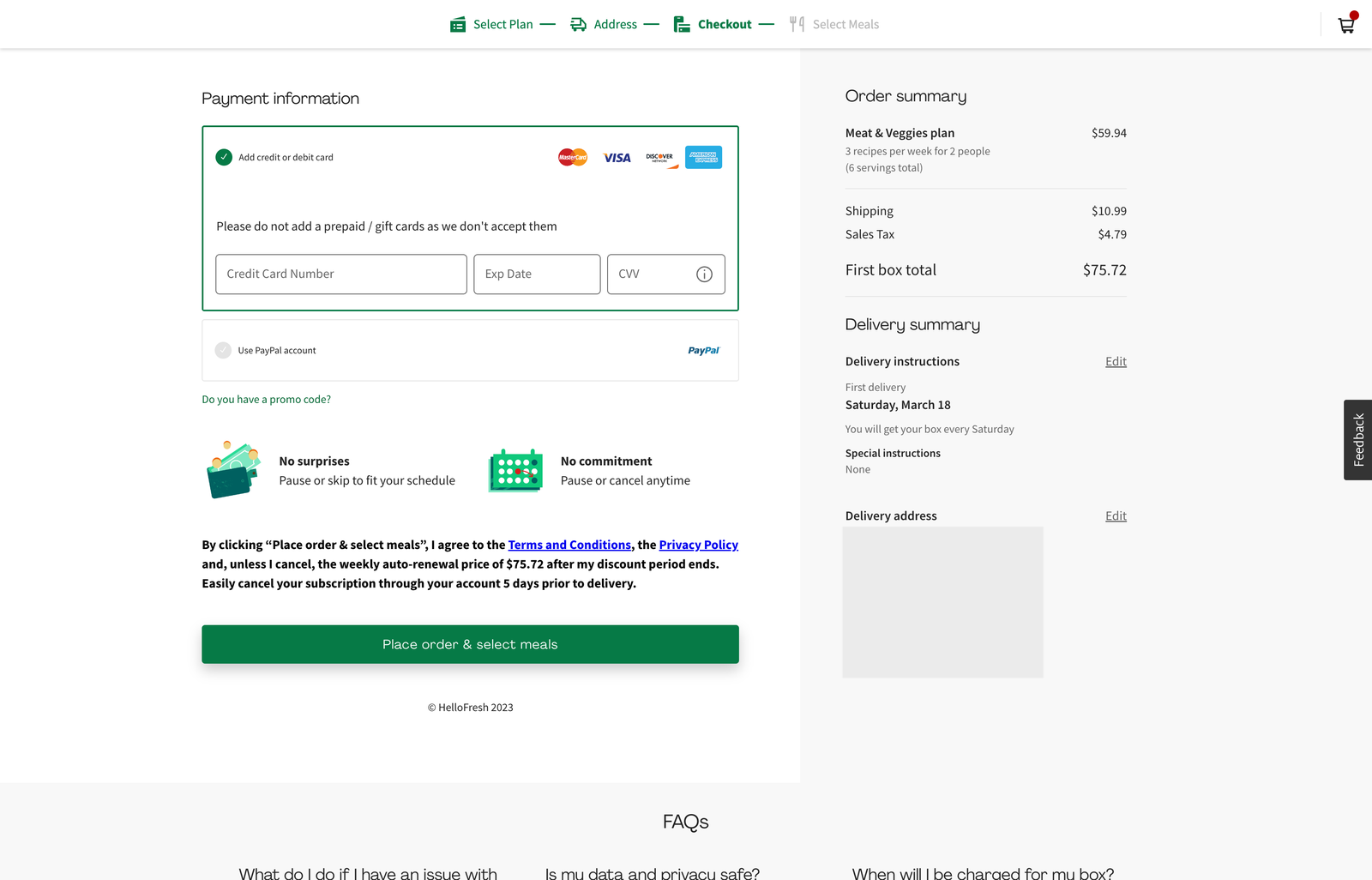
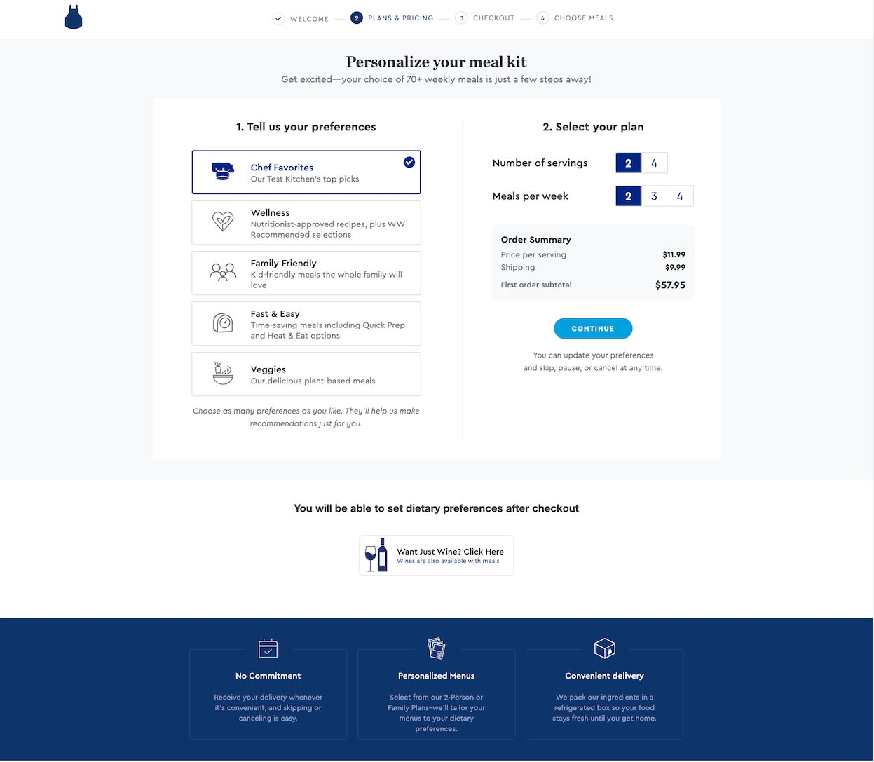
Hello Fresh uses icons to call attention to cancellation and modification info at the payment step.
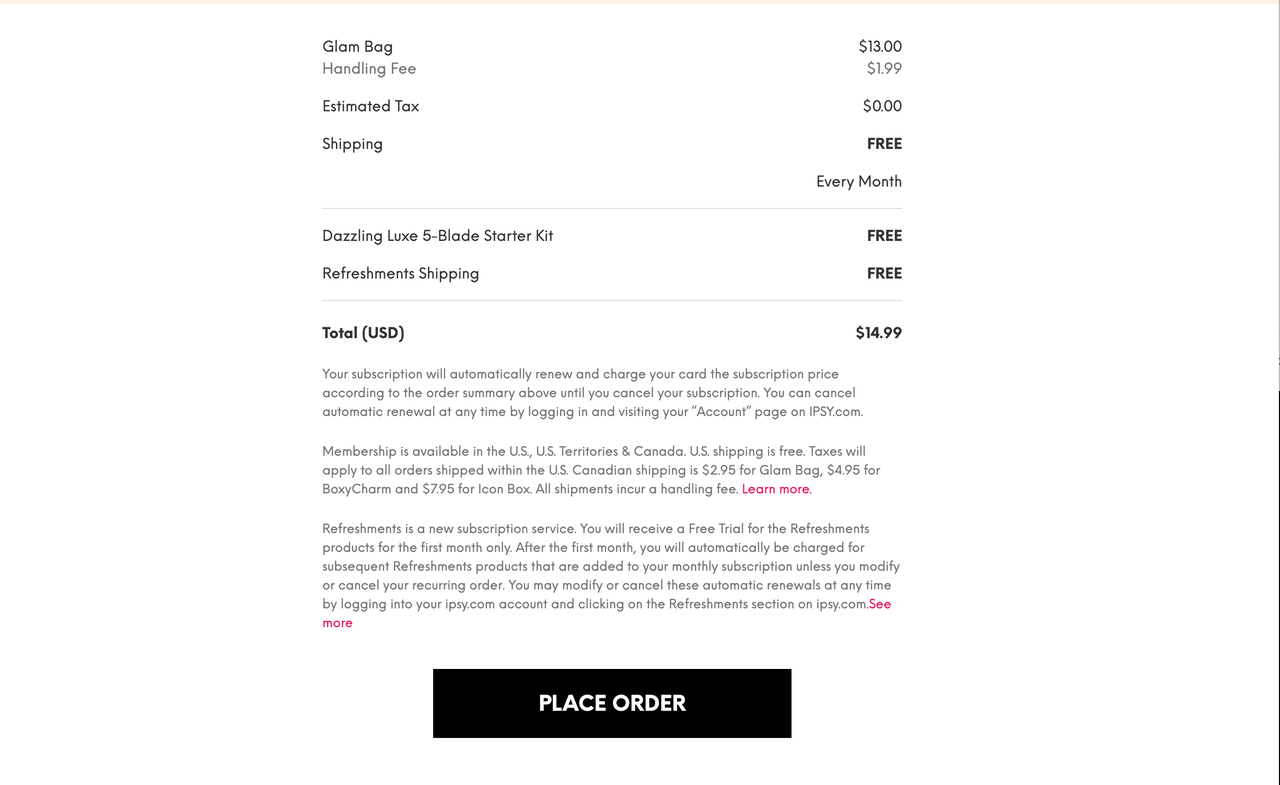
The experiences that made me the most hesitant were those that buried cancellation info in fine print, where it’s easy to ignore. Like this:
- Subscription goods often mention modification with cancellation.
Seven of the companies mentioned being able to skip, pause or edit a subscription during sign up. When it’s mentioned, it’s often in the same sentence as cancellation.
- There’s usually more detailed info in the FAQs.
Eight of the 10 companies had accessible FAQ sections that included information about cancelling subscriptions. A few included key FAQs in the sign up flow (usually at the bottom of the page). - You can save money with subscriptions, but pay attention.
Several of the companies that offered optional subscriptions gave discounts for subscribing. But, it’s worth reading the fine print - it wasn’t unusual to have the discount either only apply to the first order, or only be deeply discounted on the first order.
Standout Experiences (Both Good and Not-So-Good)
Standout Inherent Subscription: Blue Apron
While Blue Apron and Hello Fresh have very similar sign up experiences, Blue Apron’s is slightly better when it comes to calling out cancellation.
- It’s mentioned in two places on the first step of the sign up flow: below the continue button (where you’re likely to see it), and in a banner below the form. They mention it again at the payments step, both in fine print (with a link to both the terms of service and FAQs), and in bold text below the “place order” button.
- They do a great job making it clear that you can make changes, skip orders, pause the service and change your delivery date throughout the sign up flow.
- While the FAQs on the first step don’t specifically mention cancellation, they do talk about modification and provide a link to their full FAQs (where cancellation is discussed in detail).
Standout Optional Subscription: Who Gives a Crap
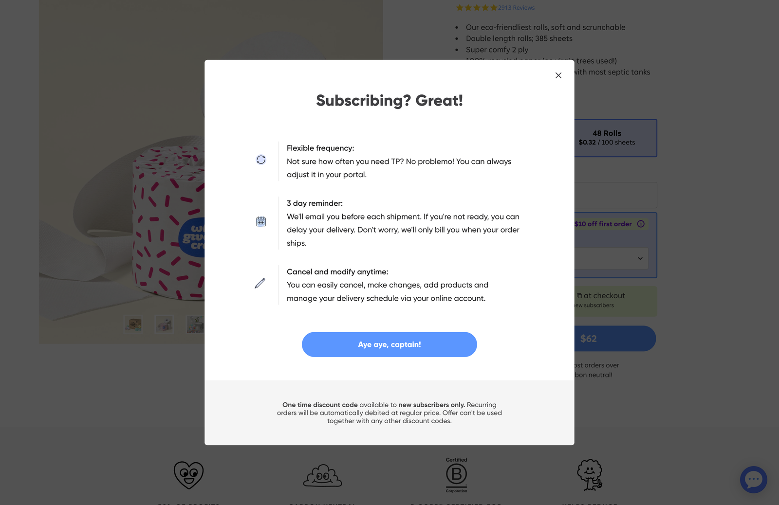
Who Gives a Crap sells environmentally-friendly paper products. While you can’t buy all of them on subscription, you can set up recurring toilet paper shipments.
- Though the product detail page has “Subscribe” selected by default, switching to a one-time purchase is easy and shame-free.
- They treat order flexibility as a feature. Both cancellation and modification are covered in a clear, well-written modal on the product detail page. They use microcopy to remind you that you can cancel or modify anytime at checkout. And, they’ve got an easy-to-find help section that has detailed info about managing your orders.
- I love that they call out their pre-shipment reminder emails. It can be easy to forget a subscription is coming when you only get it every few months - this is a nice touch that makes me feel like the company is on my team.
- They have a frequency selector tool to help you understand how many people will go through how much TP in what amount of time. It was a little detail that made me more confident about setting up a subscription.
The Darkest of Patterns: Thrive Market
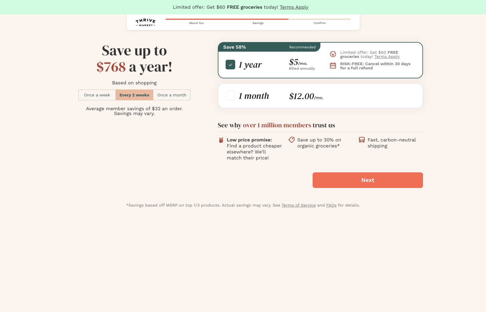
Though this online grocery store does mention that you can cancel in their sign up flow, the confusing wording and commitment to dark patterns throughout the site made me feel so uneasy that if I were considering this subscription in real life, I’d give up and go somewhere else.
- From the time the homepage loads, it feels like user experience is unimportant. The top of the homepage gives you two buttons - one that says “yes” and one that says “I like overpaying.” They have the exact same style and weight, and they both go straight to the sign up form. (Also, using copy to guilt users into doing something isn’t cool.)
- In the sign up flow, cancellation is mentioned on the “Savings” step, but only in the context of annual memberships (which they try very hard to force you into). And, it says that you have to cancel within 30 days for a full refund. There was no indication that I would be able to edit my plan, pause my subscription or skip months in the sign up flow.
- The homepage implies that you have the option to set up autoship. But they don't tell you during the purchase flow that you’ll be automatically signed up for it on the first order. It’s not mandatory to keep it, but you do have to remember to cancel it. I only know this because I managed to find their full FAQs.
- Speaking of FAQs, there are a few on the homepage, but none that mention cancellation. Cancellation is discussed in more detail in the full FAQs, but the page is hard to find. Given how little information they give up front, I feel like I’d be able to cancel, but they’d make me work for it.
- I thought I'd be able to see what products they sold before signing up by using the product categories on the homepage, but literally all of them point to the sign up flow. I have a limited idea of what they sell, or if this is actually cheaper than the grocery store (a form of price comparison prevention). Why would I sign up for a plan if I don’t know that I’ll be able to get what I need?
So, What Did I Learn
- Subscription product companies are pretty good at addressing cancellation in the sign up flow.
This could be because, unlike with services or donations, it’s hard for users to forget they have subscriptions when a physical thing shows up at their house regularly.
- If users can modify their subscriptions, tell them.
The companies that were transparent about plan modification made me feel more confident about signing up because it felt like they cared about what was right for me.
- Users assume they can manage and cancel through their accounts.
While it is important to let users know up front that they’ll be able to modify or cancel their subscriptions, the fact that they’ll have accounts that they can manage makes it more acceptable to not include detailed cancellation info in the sign up flow.
- The more unique the pricing model, the more important it is to provide details.
Take, for example Fabletics, where you pay a $59.99 monthly “membership fee” that becomes store credit if you don’t skip it by the 5th of each month. Without a clear explanation, it can be easy for people to sign up for a subscription without realizing exactly what they’re getting themselves into, or how to get out.
- Reminder emails are awesome.
Only three of the companies I looked at mentioned that they send reminder emails before shipments. It’s possible that more do, but only a few made it explicit. These emails build confidence and trust - users know they’ll get a heads up when their goods are about to be shipped, and they have time to modify or cancel the order before being charged. It’s a little thing that makes users feel seen and cared for.
Next Up:
I’m going to repeat this process with 10 subscription services and 10 charities that offer recurring donations to see how they handle talking about cancellation before sign up. Will there be similarities? Differences? Totally new patterns? I’m excited to find out.
*Companies I looked at during this UX review included: Amazon (recurring purchase with Prime), Blue Apron, Chewy, Dollar Shave Club, Fabletics, Hello Fresh, Ipsy, Misfits Market, Thrive Market, Who Gives a Crap.