
These days, it seems like every major network - Disney, Paramount, Discovery, Apple - has its own proprietary streaming service. What do you do when one of those companies produces a zeitgeisty show you really want to see? You either miss it, have a friend share their password, or subscribe to yet another service.
That’s how I wound up with HBOMax. I wanted to watch the Gossip Girl reboot (spoiler alert: it’s terrible). I wanted to watch Succession. And, it was the only place I could watch the greatest dating show of our time, F-Boy Island (RIP).
But, with all of these shows either over, about to be over, or unceremoniously cancelled and removed from the platform entirely, I’m not sure how much longer I want to keep subscribing. It’s got to be easy to cancel, right?
I'm on a monthly plan, so I’m not locked in to a contract. Even though I don’t remember seeing any specific information about cancelling when I subscribed, I have an account that I assume I’ll be able to manage (like on other streaming services).
But what if I’m signing up for a type of service I'm less familiar with? What if it isn’t so clear? What if I’ve paid annually to get a better deal - can I still cancel? If the service doesn’t provide any information about cancellation before I subscribe, or the info they give isn’t clear, will I still sign up?
That’s the core question I’m trying to answer in this series. I’ve started to look for answers by doing UX reviews. First, I wanted to see how companies that offer subscription goods talk about cancellation before a user signs up. Now, I’m repeating the process with 10 popular subscription services. Will they use similar patterns? Will they be different? How do they address cancellation in situations where there are free trials or annual pricing?
Let’s find out.
How I Went About It
I picked 10 companies* that offer subscription services. While there are a ton of subscription-based software products for professionals, I chose to focus on services for personal use - things like streaming video, delivery services and fitness apps.
To evaluate them, I set some limits:
- While many subscription services are offered as bundles or through third party companies, I went old school and reviewed the sign up flow on each company’s website.
- To keep things realistic, I picked the plan I’d actually need or want. When there were survey questions during sign up, I answered them honestly.
- I focused on how each company presented information about cancelling subscriptions in the sign up flow, starting from the homepage or sign-up button, and stopping at the point where I had to pay to continue.
- I also looked to see if cancellation info was presented outside of the sign up flow, like in FAQs, body copy, etc.
- I reviewed all of the sites on my laptop, working under the assumption that the experiences in mobile browsers or apps would be similar.
Note: I reviewed HBOMax before it changed names to Max. The new experience is similar, but the screenshots are from the old experience.
Starting to See Patterns
Subscription services and subscription goods follow some of the same patterns when presenting cancellation info during sign up. There were similarities in the language used, the amount of information given and where it showed up in the flow.
- Nine of the 10 companies I reviewed mentioned cancellation at least once during sign-up.
Five mentioned it multiple times. Four only mentioned it once during sign up, but it felt reasonable - sign up flows for subscription services tend to have fewer steps than they do for goods. Most of the services I reviewed also had cancellation information elsewhere on their sites, most commonly on landing pages, in FAQs and Help Centers.
- Cancellation info is typically placed where users are likely to see it.
All of the companies that included cancellation info had it at the payment step, often placed above the submit button. The info was usually presented as plain text or in fine print. The best experiences made sure the info was highlighted and hard to miss.
Amazon’s cancellation info is at the top of the payment page in an easy-to-skim format.
Netflix did a cool thing - they had a step in the flow that seemed designed to slow users down to make sure they understood key details. While they also had cancellation info at the payment step, the extra screen made it very hard to miss.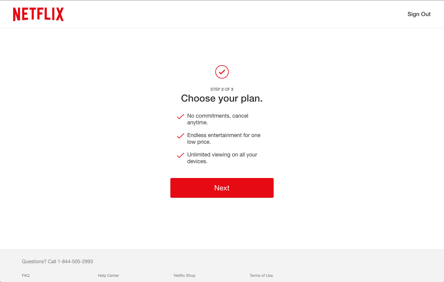
One step in Netflix’s sign up flow is designed to make sure users don’t overlook some of the most important facts about the service.
Cancellation was also frequently shown on landing pages, and occasionally at the plan selection and account creation steps.
- Subscription services were likely to offer free trials or discounts as incentives.
Half of the services offered free trial periods (ranging from a week to a month). In all of these cases, users had to provide their payment info before starting the trial.
There was a time not too long ago when it was common to let users have a free trial, then ask for payment info. I get it though - while that model might be the most transparent for users, it also could be an inconvenience if they know they want to keep the service. And, businesses are at a distinct advantage when they get the money up front.
- You can get discounts for committing.
Babbel, DashPass, Prime and Max all offered significant discounts for paying annually instead of monthly. In these cases, it seems like the cancellation messaging in the sign up flow should change to include specific information about cancelling annual plans, but it stayed the same.
- All of the services automatically renew subscriptions until the user cancels.
For example, if you buy a year subscription to the Wall Street Journal for $1/week as part of their promotion, at the end of the year, the price automatically jumps to $9.75/week. The same goes for services that offer free trials and services that you pay for in blocks of time. And, I doubt the companies will call attention to the price increase when it happens.
The experiences that I trusted most were those where the renewal terms were prominently placed and explained in human-friendly language, like the New York Times and Babbel.
The New York Times used a callout box with plain language and bold text to explain escalating payments. I love that they say exactly what the price is now, and what it will be after the first year. 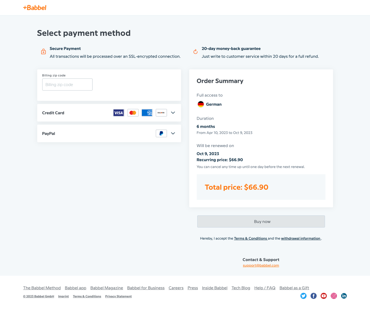
Babbel provided a renewal date, a renewal price, and information about when to cancel to avoid being charged.
If they wanted to take these experiences from good to chef’s-kiss level great, they could let users know that they’ll send an email (or two!) to remind users that their renewal date is coming up, let them know of any price changes and give them a path to manage their account.
- Some companies use the sign up flow to explain the service.
ClassPass, Babel and Noom all used their sign up flow to introduce features and benefits. It’s an interesting approach: get users in the funnel, then explain how the service works.
ClassPass does this over the course of three screens, while Babel and Noom pepper this info in while asking questions about you and what you want to get out of the service. In both of those cases, it was easy to skip over the info, especially when the flow was long.
In the sign up flow, Babbel mixes data-generating questions with features that a user might miss if they jump straight into the sign up flow. - Subscription services were far less likely to mention modification.
This makes sense, as they’re less likely to offer the ability to pause service or skip months than companies that offer subscription goods. When it comes to upgrading or downgrading plans, it’s likely that users assume they’ll be able to do that through their accounts.
Standout Experiences (Both Good and Not-So-Good)
Good: ClassPass
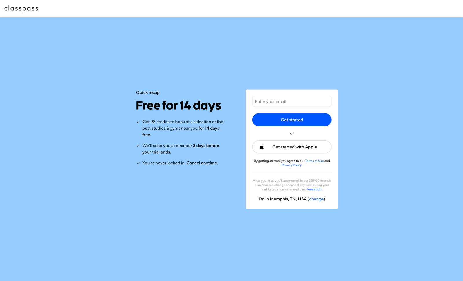
ClassPass lets users buy credits every month that can be used to try fitness classes, gyms and spas. While the service can be a little pricey (the default after trial period is a $59/month plan), their sign-up experience is informative, clear and user-focused.
- Cancellation is mentioned in multiple places in the flow: on the onboarding screens, at the account creation step (in both bold text and fine print), and again during payment. It’s also discussed in more detail on the Plans page and in the Help Center.
- They offer a 14-day free trial. While you do have to provide payment info to start the trial, ClassPass makes it very clear that you’ll be charged in full when the trial ends. They also let you know to expect a reminder email a few days before you’re charged. Between that and how openly they talk about cancellation, I’d feel pretty good about signing up.
- They make it easy to see what classes and appointments are available in your area before you commit. This is helpful for users who are trying to decide if the subscription will be worth it.
Could be better: Max
Max's sign-up flow is similar to the ones used by Netflix and other streaming services. But while Netflix highlights cancellation, Max doesn’t. Like at all.
- Cancellation isn’t called out in any of the usual places on the homepage, or in their very short sign up flow. It feels a little arrogant, like they think that no one would ever possibly need or want to stop using the service.
- In order to find any information about cancelling, you have to go to the very bottom of the footer and locate the tiny link to their Help page.
- It’s not clear why they don’t mention cancellation. The best case is that it’s an oversight. Or, it could be intentional - maybe they have reason to believe that if users have any basic information about cancelling, they won’t buy. Maybe they're relying on users to be familiar with streaming services, and assume that they can cancel via their accounts. It could be all of the above. Whatever the reason, it doesn’t make me feel more confident in my purchase.
Strange, but Kinda Good: Noom
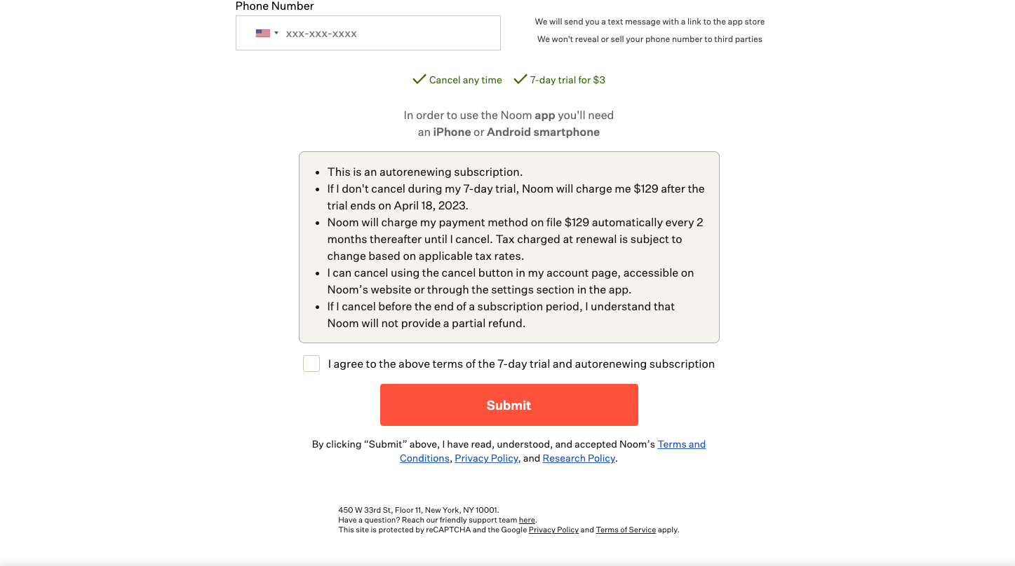
Noom is a subscription wellness and weight loss program. Of all of the services I reviewed, their sign up flow was the most interesting. It was a little overwhelming and a teeny bit invasive, but it also had one of the most clear cancellation explanations I saw (even if it took forever to get there).
- While the homepage does a great job at getting users into the sign up flow, it doesn’t do much to explain what the company offers. It assumes that anyone who lands on the site (or downloads the app) already knows the basics, and is willing to go through the sign up flow to get more information.
- The sign up flow is long - like really long. It mixes information about features with survey questions to get personal data that they claim to use to design a custom wellness plan. While the survey felt somewhat useful, I had to give up significant time and a lot of personal details to get to the point where they explain how the subscription works and how much it costs.
- Though they don’t let you know before you start signing up, Noom does offer a trial period. It’s strange that you have to pay for it, but you can name your own price.
- They give you 15 minutes to buy the plan they’ve set up for you, which feels like a lot of pressure, since it’s the first time they give you any indication of the cost. They also don’t let you see the details of your plan without committing.
- That said, their cancellation info is clear and hard to miss. They tell you when your trial will end, and let you know how much you’ll be charged on that date. At the payment step, there’s a call-out box with user-centered language that fully explains the auto-renewal cadence, cancellation policy and gives details on how to cancel. They also let you know they’ll send a reminder email before the end of the trial period.
What Did I Learn
- The account assumption holds up.
As users, we assume that we’ll be able to manage our subscriptions through our accounts. This seemed true for goods, and it might be even more true for services. The knowledge that you have an account makes it more acceptable to limit the amount of cancellation info shown during sign up.
But, if a company doesn’t let people cancel online through their accounts, they should let users know before sign up and after (looking at you, Wall Street Journal).
- A nod is better than nothing.
Even when accounts exist, it’s better for user confidence when companies acknowledge cancellation at some point during sign up. It doesn’t have to be extensive or repetitive, it just needs to be there.
- Reminder emails are still awesome.
Only three companies - Audible, ClassPass and Noom - explicitly said they send reminder emails when a trial is about to end. This is one of those little things that helps users feel seen, like the company is on their side.
I get the business reason for not sending reminders when trials or discount pricing ends. But the reminders made me feel more secure, leading me to have a better impression of those companies.
- The best experiences are the ones that clearly explain how trials and auto-renewals work.
When I sign up for a monthly subscription service, I assume that I’ll be charged monthly. But, when a company offers a free trial, or has annual or block pricing options (ex. pay 3 months at a time), it’s important to be explicit. The best experiences were the ones that told me what date the service would auto-renew, let me know exactly how much it would cost, and told me what the cancellation terms were for different types of plans.
- Cancelling can be tricky depending on where you paid.
When a company has both a browser experience and an app, it’s likely that people who subscribe in the browser have to cancel in the browser, and those who subscribe in the app have to cancel via an app store. If you want to know if this is the case before you sign up, check the FAQs - it’s often explained in detail there.
Next Up
Now that I’ve done UX reviews of subscription goods and services, I’m going to repeat the process with 10 charities that offer recurring donations. I have a hunch those experiences are going to be very different.
*Companies I looked at during this UX review included: Amazon Prime, Audible, Babbel, ClassPass, DoorDash’s DashPass, Max, Netflix, New York Times, Noom, and the Wall Street Journal.