Ballpark UI Redesign
Freelancers and agencies love Ballpark for its efficient invoicing and time tracking tools. After a year of owning and using it as a mid-sized agency, we knew it was time to make it ready for the big leagues.
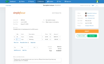
Ballpark is an invoicing and time tracking app originally designed by MetaLab that's helped thousands of freelancers and creative agency owners grow their businesses and make more money. Its dead simple UI makes creating and sending invoices and estimates a breeze (true story: we only got one or two support tickets a week, and they were usually feature requests).
MetaLab redesigned the app in 2012, but it hadn’t had any visual updates since, despite UI design standards evolving. We worried that its target users (design-sensitive creatives) perceived it as clunky and unloved, when that couldn’t have been more untrue.
And, as users of Ballpark ourselves, we wanted to add some new features that would make it more useful for people running businesses like ours.
Taking everything we know about design trends in app interfaces, we did some deep thinking around user flows, and focused on creating micro-interactions that make users feel like the app is helping them use it.
Modernizing, not Revolutionizing
Our biggest priority was modernizing the app’s UI design without sacrificing any of the interactions that already worked so well.
Because most of the existing user flows worked well, we found we could have the biggest impact by focusing on micro-interactions, and modernizing the UI to be faster and more helpful.
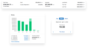
We flattened the design and rethought the color palette. We also improved scannability by simplifying layouts, increasing font sizes and establishing a visual language that used tables and cards to distinguish data from summaries.
Putting Data to Work
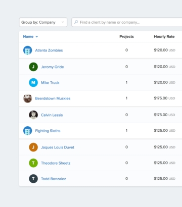
We underlined the relationships between types of data - clients have projects, which have time and expenses tracked against them. By connecting these disjoined data types, we were able to give users better reporting, organization and processes. We reworked the app’s information architecture so users could see more data, understand it clearly and put it to use when running their businesses.
A New Front-End
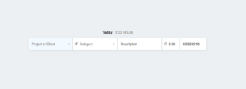
To support our new information architecture, we completely rebuilt the front-end using React, which is a JavaScript library for building user interfaces. Because React is component-based by design, it made it easy for our team to change the look of components based on their states (like a running timer vs. a stopped timer).
But Wait, There’s More
Based on requests we got from users, we added:
- Ways to surface every interaction a user has ever had with a client through Ballpark.
- Automated payment reminders for overdue invoices.
- Filtering to help users surface important data faster.
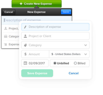
- Inline creation and editing throughout the app.
- A modular dashboard with important metrics about payments, tracked time and invoice statuses.
Now, Ballpark users have more robust reporting and better processes for entering, managing and using their data. These new features help our customers run their businesses and form a foundation for the next several years of product updates.
