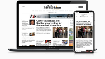
The Daily Memphian
The job: help a team of veteran reporters, photographers and publishers revive journalism in Memphis and create a unique new model for local news organizations. Our role: designing a user experience on par with The Washington Post and New York Times, from scratch, in 90 days.

We had a ton of work to do in order to design and build the site, and the launch deadline was crazy tight, so we relied on our trusted process. We hosted workshops, architected the site, and wrote functional requirements for the design and development teams. We also designed and built front-end code for more than 20 page templates using a modular design system.
The site is managed on a custom CMS, and the Memphian's staff were some of the site's most important users. We worked with them to understand their publishing workflow and content needs. Along with our sister agency, Clear Function, we designed a system that handles complex rules and publishing guidelines to produce a flawless front-end experience for readers.
The site launched on September 17th, 2018. It performs flawlessly across devices so readers get what they’re after—local, important and engaging news. It’s easy to share and easy to get around. It gives the publishers the tools they need, and is engineered to grow and evolve with the publication.
As people with a vested interest in Memphis, we’re humbled to be a part of this movement and can’t wait to read the next issue, and the next, and the next.

